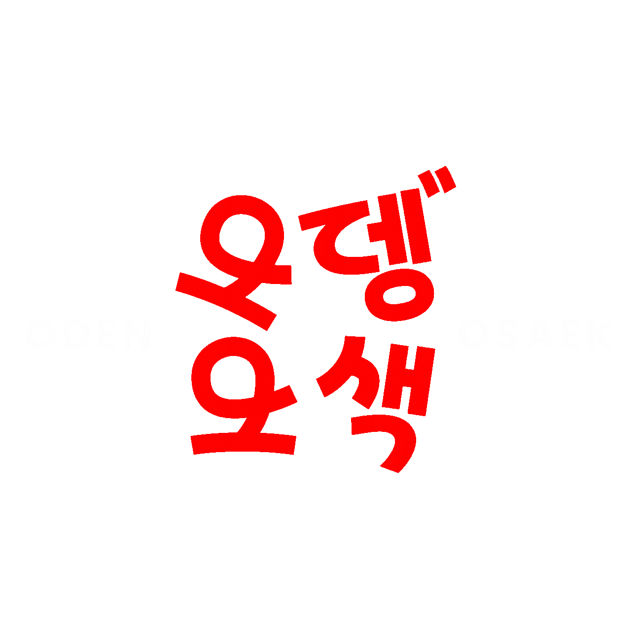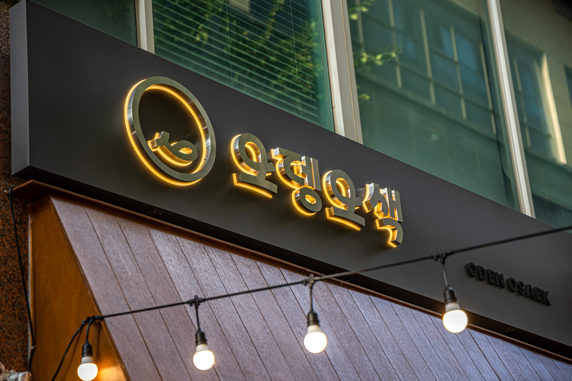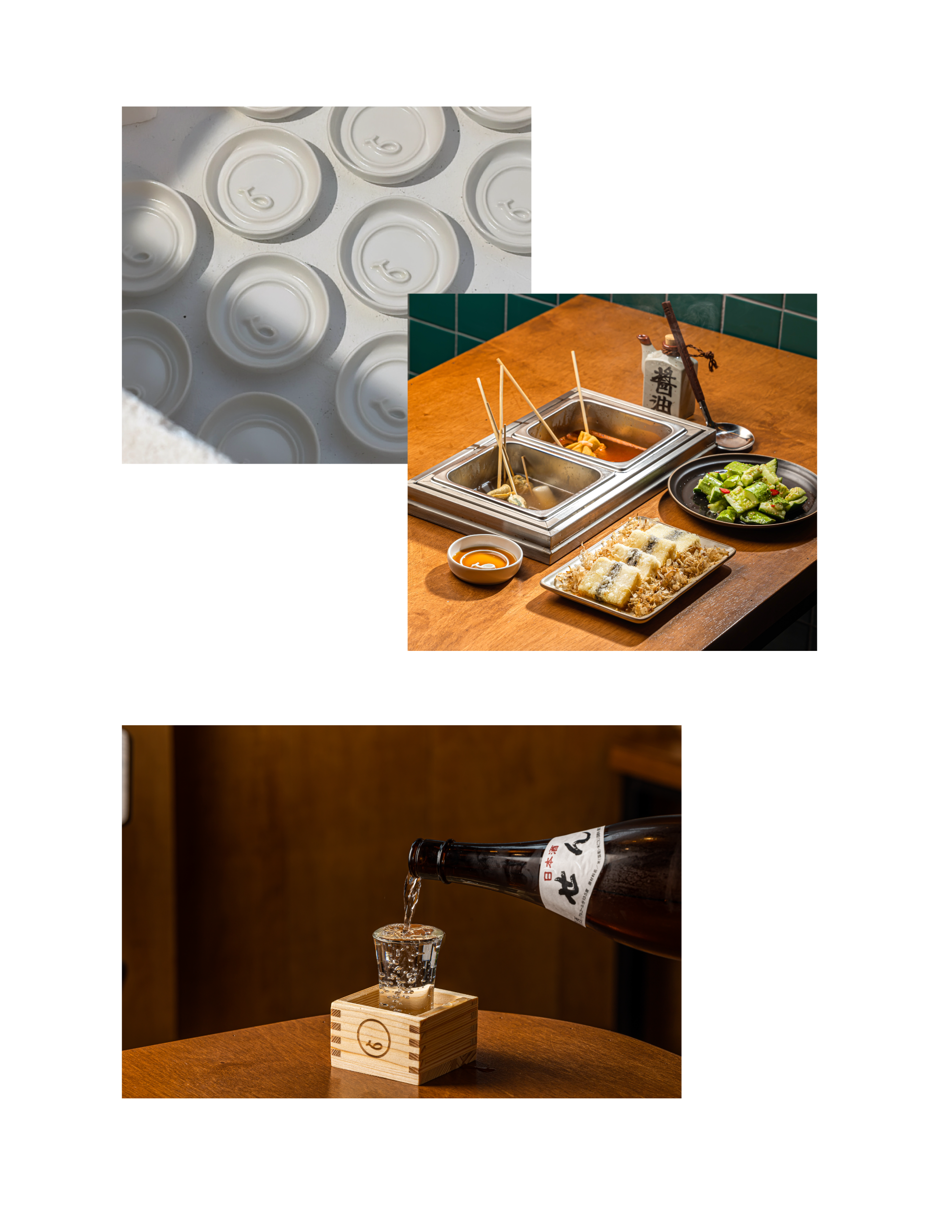


Oden Osaek is South Korea's premium Oden bar brand, boasting expertise and diversity in fish cakes. "Oden" refers to a fish cake made by crushing, cooking, and hardening fish meat, and "Osaek" symbolises the five brand colours, representing diversity, colourful tastes, and shapes.
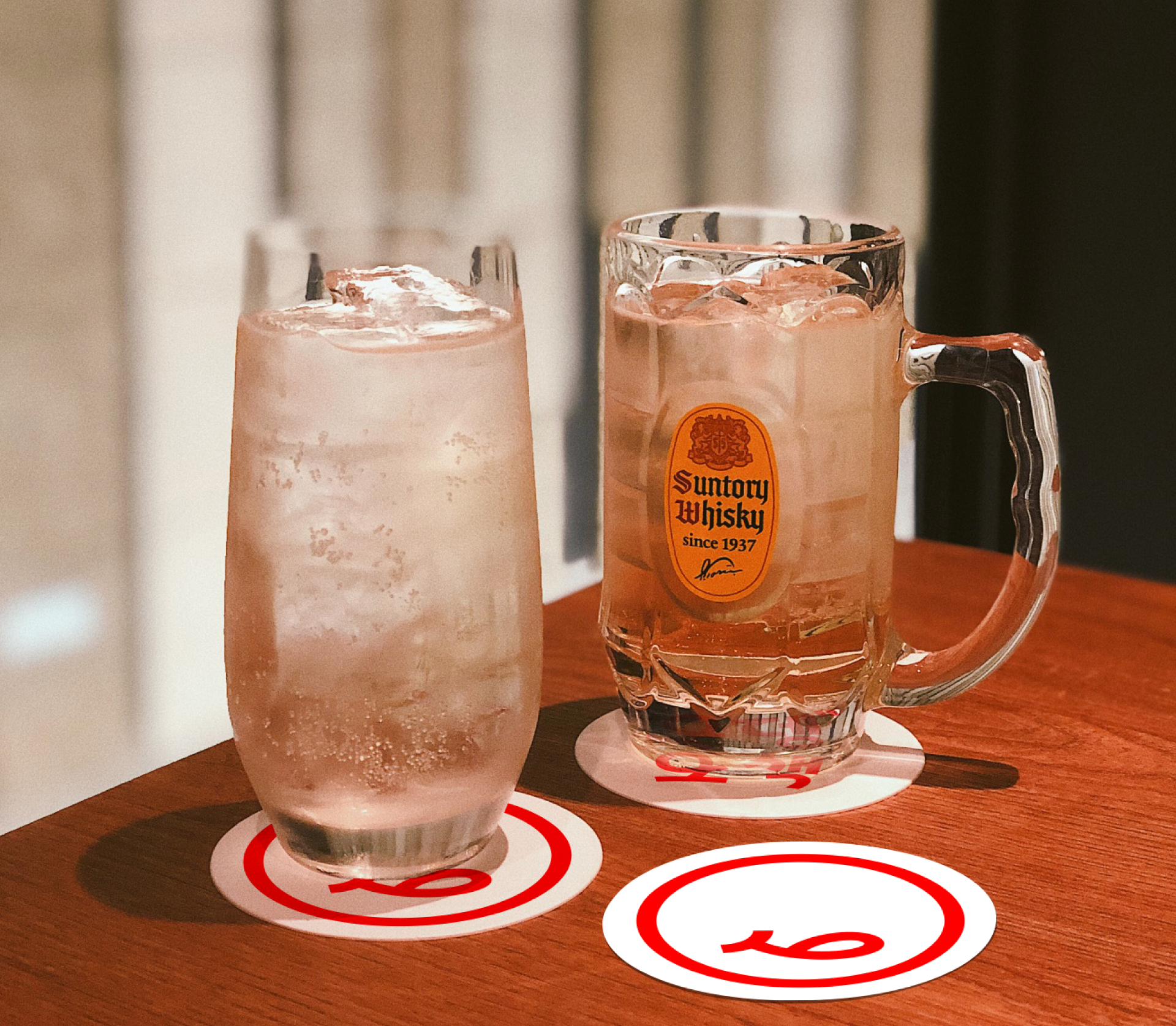
This brand selects high-quality Odens and provides five sources based on professional technology and know-how, providing consumers with various choices. In addition, Oden Osaek also focuses on conveying brand messages and values to consumers. Our brand spirit respects and supports a lifestyle that pursues diversity and enjoyment, and our goal is to provide consumers with not only taste but also experience and delight.
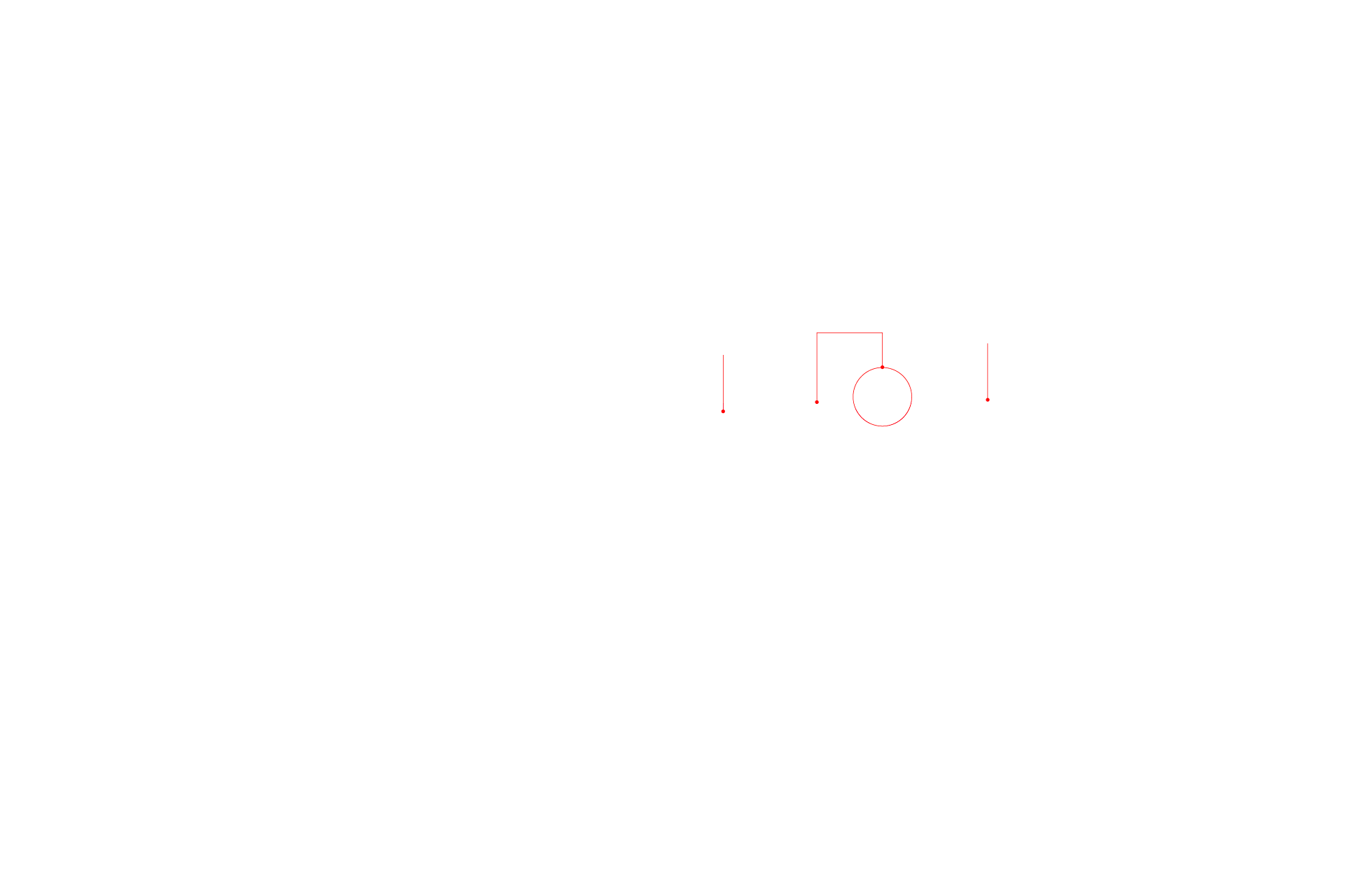
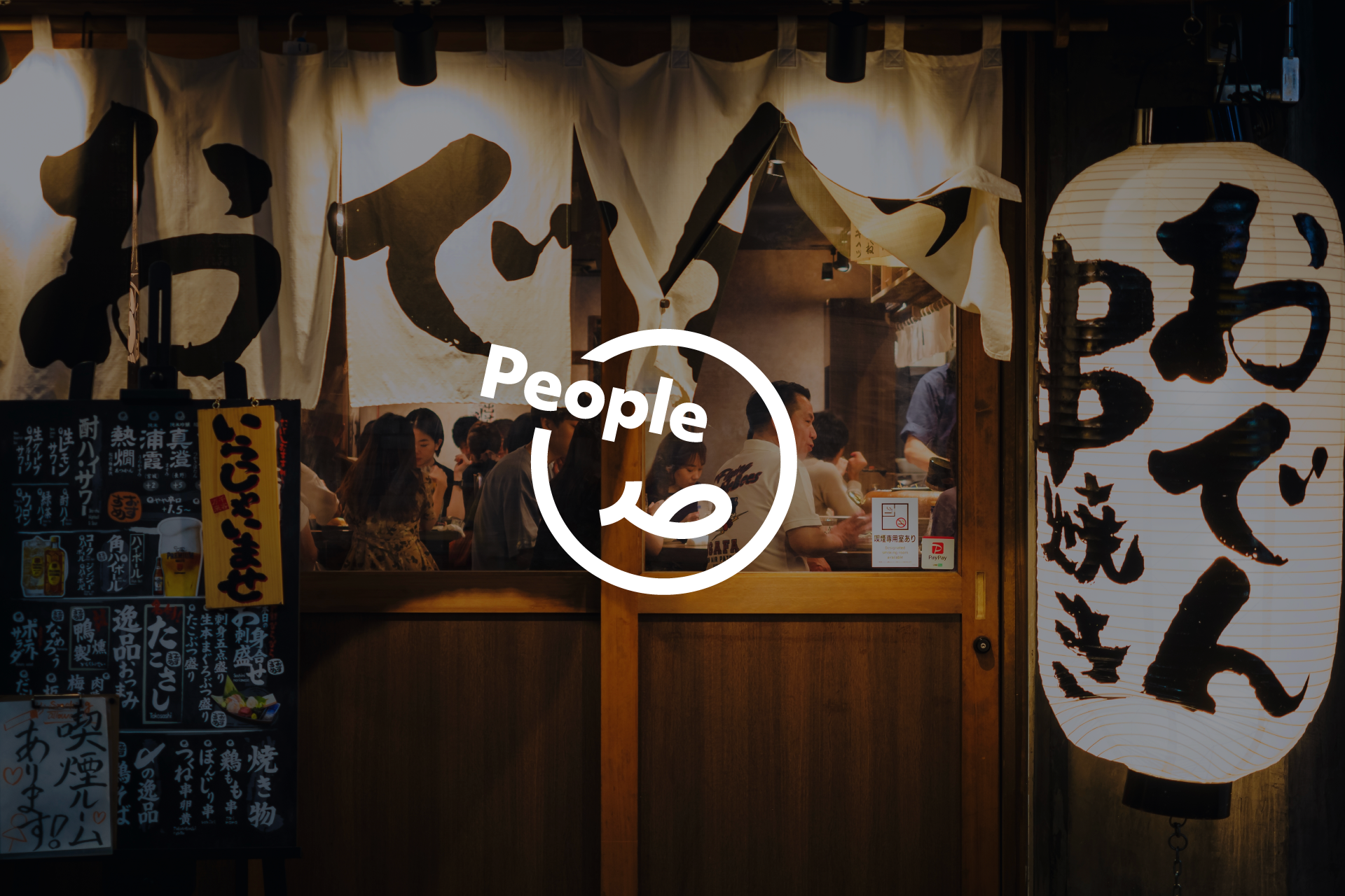
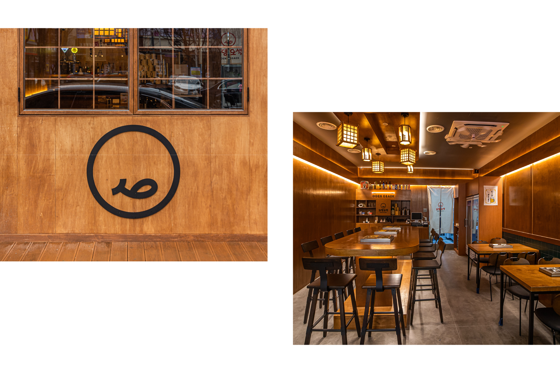
While Oden Osaek's brand emphasises premium, it has a visually witty and intuitive brand identity. The symbol's smile provides consumers with a visually and tasteful delicious experience. Besides, the logotype is designed using the curved shape of the Oden to consider the connecting meaning of merging taste and experience.
WORK SCOPE
Brand Strategy, Brand Identity Design, Communication Design
CLIENT
Oden Osaek
YEAR
2023